

funnycamel
-
Posts
14 -
Joined
-
Last visited
-
Days Won
1
Content Type
Profiles
Forums
Gallery
Downloads
Articles
Store
Blogs
Everything posted by funnycamel
-
Hello. i'm using Thirtybees 1.1.0-1.1.x I have found that a hacker can send emails on behalf of the website via the CMS, the email goes to ALL customers. I believe this is through some kind of hack via the contact form. For now, I have just completely disabled the Contact Form. Any advice on how to address this issue?
-
In less that a month I've got my site up and running and have received orders successfully - much quicker than I expected. There was no messy coding required at all. Just a couple of light edits to some .tpl files and some CSS styling. So yeah, it does work out of the box as far as I'm concerned. What prompted me to finally choose TB was the response to my initial question. Knowing there's a friendly community here gave me a great deal of confidence. Special thanks to @toplakd for making Community-Theme-Modded available, it really makes the mobile experience so much better. Thanks also to @datakick for providing some vital knowledge, and to @musicmaster for offering Prestools which saves so much time updating product info.
-
BO -> Localization Then in "configuration" select the default language. If you want English every time, then you also need to change "Set language from browser" and "Set default country from browser language" to "No"
-
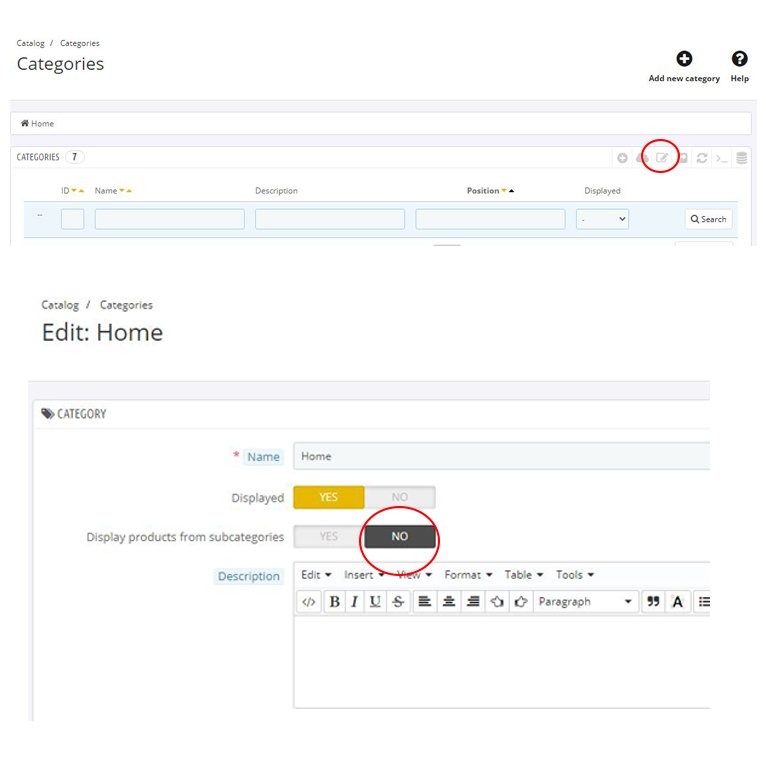
I found the answer. There's a setting which was hard to find for the Home category and I needed to set it to "No" for "Display products from subcategories". I uploaded the image of both pages for anyone who is interested. First you need to click the little edit icon, then change the subcategories setting. So two things I learned today.. resetting the ntree and accessing the Home category settings.

-
EDIT: This can be ignored. It was an oversight on my part (see next post). @datakick Thank you for the additional suggestions. It doesn't appear to be any issue with the DB, but I think I found the problem. BlockHomeFeatured makes a call to the getProducts function of Category.php, which traverses not only the given category, but also includes all subcategories, such that the following code (similar to that in BlockFeaturedProducts module) will show all 120 products: The code of getProducts in Categories.php responsible for including all subcategories is this $subcats = $this->getAllSubcategories(); $catsToSearchIn = [$this->id]; if($subcats && $this->display_from_sub) { foreach ($subcats as $scat) { $catsToSearchIn[] = $scat['id_category']; } } This means that selecting the Home category in the BlockFeaturedProducts module will show every single product, because Home is an ancestor node of all other categories. It's also clear that getProducts doesn't have any parameter to disable traversal of the subcategories. Am I missing something here? My understanding was that BlockFeaturedProducts would show only products which have the "Home" category ticked under associations, but this doesn't seem to be the case. If that's so.. then silly me.
-
@datakick Thank you, that's incredibly helpful and solves 90% of the problem. Indeed, the ntree values were messed up and now the original problem doesn't exist. The remaining problem is the BlockHomeFeatured still shows products that are not associated with the Home category (then they cease to show if I associate them with the home Category). Is there anything else that could be messed up which may be causing this? My best guess as to why this occurred is because I was using PresTools to update categories.
-
Thank you for the reply. I checked everything very carefully, there are no duplicates or anything like that. I have also noticed that products are showing up on the homefeatured page which are not in the home category (I have homefeatured set to display products from the home category). Absolutely nothing seems wrong in the DB. The most likely cause would seem to be cache, but I already disabled the cache. This is too weird. Is there any other kind of cache that needs to be disabled manually?
-
Hi all. I believe I've come across a bug. I've got a category called CatQ whose parent is CatB. However, each time I open CatQ in the Front Office it comes up as a subcategory of another category (let's call it CatA). So I get: Home / CatA / CatQ When it should be: Home / CatB / CatQ I checked the DB and parent ID of CatQ is assigned to CatB correctly in the category table. I have totally disabled the cache as well. Any ideas would be appreciated.
-
I've been using this because it seems like the quickest way to getting ThirtyBees working in a mobile friendly way. It's really great work and has saved me an enormous amount of time. My focus has been on the checkout, because this is where small issues can scare customers away. Here I would like to share some small but important issues I had that are related to checkout and the ways I resolved them. I am not sure if these issues are caused due to my inexperience and whether or not my fixes are correct, as I'm new to ThirtyBees. It's for reference only. 1. In the checkout, if the customer forgets to tick the Terms and Conditions box, the error notice displayed in the fancybox doesn't fit on the screen on certain mobile displays (e.g. iPhone X). To fix it, I changed the white-space from nowrap to normal by adding this CSS: .fancybox-error { white-space: normal; } 2. When the user clicks "Read the terms of service" (once again this is using iPhone X), not all of the text can be seen (some words are cut off at the right of the box). To fix it, I changed min-width from 360px to 280px as follows: #cms.cms.cms-3.cms-terms-and-conditions-of-use.show-left-column.hide-right-column.content_only.touch { min-width: 280px; } 3. When you use the native PayPal module and have Website Payment Standard enabled, the positioning of the text "Pay with your card or your PayPal account" looks a bit horrible on mobile, as it's on the right of the Paypal graphics and doesn't fit very well. To fix this, I did an override of the PayPal module's template file express_checkout_payment.tpl and added a line break just before the line of code {l s='Pay with your card or your PayPal account' mod='paypal'}. In this way, the text displays nicely under the Paypal graphics. There was one other small thing not related to checkout. The Store Information was duplicated in the footer. This is fixed disabling the custom HTML block" Store Information" in the footer (BO -> HTML Block -> Customs Blocks).
-
@datakick Yes, that was the issue! Never would have noticed it, thanks a lot!
-
@veganline Thank you for that nuanced explanation of the checkout issues. I will play around with it. @datakick How do you actually get onto the Bleeding Edge Channel without messing things up? I took a simple test case using all default settings and no extra modules and it didn't work. Here are the steps I followed: 1. Install thirtybees from Softaculous in cPanel with default settings (this installs 1.1.0) 2. Go to Core Updater and change the channel to "Bleeding Edge". 3. Clear Cache 4. Try to load the Front Office and get the following error message ThirtyBeesException Unable to load template file 'localhost/themes/niara/./product-list.tpl' in 'localhost/modules/blockbestsellers/views/templates/hook/blockbestsellers-home.tpl' in file vendor/smarty/smarty/libs/sysplugins/smarty_internal_templatebase.php at line 129 It seems like the update somehow messed up the paths. I tried it with the community theme as well, and yielded similar results.
-
@datakick In Core Updater, under Channel there are two choices. One is "Stable", the other is "Bleeding edge", but from what you've said the bleeding edge version would have the fewest bugs and seems to be the best choice. This is actually quite important to know, so thanks for providing this info. Are there any other things like this which are not obvious yet important to know?
-
Thank you for all the replies. It's sounding as good as I could hope for. I will be very selective when installing modules. The only extra thing I've needed to install is Community-Theme-Modded in order for everything to display correctly on mobile devices. I am very tempted to streamline the checkout a bit, but that seems like asking for trouble at this point. ThirtyBees is the only free e-commerce system I've tested which seems to tick all the boxes, and I didn't even know it existed until a few days ago!
-
Most free e-commerce software I've tried doesn't work properly out of the box. There'll be a checkout bug or something won't work on mobile, and expensive plugins will be required to create a viable site. What's the situation with ThirtyBees? Does the stock version Just Work (tm)? Are there any show-stopper bugs or plugins that need to be purchased to create a viable site? I've been playing around with it and so far I haven't found any problems, but from prior experience with other software I know that bugs rear their head at the worst time, so I want to check with the community before I take the next steps.