

Mike1
-
Posts
14 -
Joined
-
Last visited
Mike1's Achievements
")
Newbie (1/14)
0
Reputation
-
I was experiencing the very same thing with our checkout too. Like you, no modifications to the checkout was made and it left me feeling confused why such things were happening, and randomly. I couldn't see any pattern to it all. And then one day I realised what it was and it's got nothing to do with which device or browser the user is using... it's actually the email address. Basically, if a user leaves a space at the end of the email address, the checkout refuses to check the database and is left 'waiting' or in limbo. The moment that trailing space is removed, all is well. Unless it's something else I am not aware of, this seemed to be the solution that worked for me.
-
Hi all, We've been trying to figure out why some customer, after entering their email address at the checkout, are neither asked to enter a password (if they're a returning customer) or a blank customer profile/shipping form (if they're not). This had been an issue ever since the Chex module was installed and configured around a year or so ago. Today, we finally figured out why and I'm hoping there's an easy fix... The problem is that when a visitor/customer enters their email address and, for whatever reason hits the space bar to enter a space at the end of the email address, nothing happens. The moment they hit the backspace key to remove the unneeded space, the checkout then proceeds with its checking routine and the whole thing works just as it was designed. Unfortunately, customers are either unaware of what they have done or just don't see it as a problem. We didn't know this was happening until a customer came into our store and showed us the problem on their mobile phone. So, what can be done about this? Any ideas?
-
Hi, I don't see if this issue has been reported before but has anyone noticed the text on the bottom of the emails (footer) that customers receive when asked to submit a review? Part of the text says this: "Revws - your datakick review module". The word 'datakick' is clickable and when clicked, the link takes customers to the getdatakick.com website and I'm not sure why it needs to be there??? Is it a legal requirement, considering the module is free or can it be easily removed without any issues?
-
It's been a while since I last checked the comments in this thread (there are so many now) so, I was wondering if there was any development happening with respect to the handling of Customer Reward Points?
-
Sound great. So, when do you think we might see some of these changes/improvements? I think it's important that modules offer options and a degree of flexibility since most merchants will have different/special needs.
-
Hi Petr, I've been looking forward to the release of the premium version 2.2.0 for a little while now... any news on how far away the release might be?
-
Thank you for your suggestions, Petr. The issue has now been resolved. We uncovered a missing trailing bracket in the css of a payment module.
-
I'm wondering if anyone is having this problem or knows of the solution? For some reason the CSS isn’t loading on mobile devices. In other words, the checkout is unformatted and is looking very ordinary. Desktop is loading fine btw. The site is running on the Panda theme and I have the OPC installed on TB version 1.0.8. Thanks
-
Excellent. However, I found a couple issues that probably need to be resolved also: 1) Adding a new address that is of a different country to that of the shipping address is impossible since there is no country field anywhere to be found on the form. For example, if I were to send an order to the USA (for example, as a gift) and I wanted to enter an Invoice address of Australia, unfortunately I am unable to select Australia and therefore I'm unable to choose the correct state of Australia either. 2) If I am logged in and move away from the checkout and then come back to the checkout again, the shipping address that I had previously selected is no longer there, and I am then presented with a blank form. Maybe if there was a way to bring up the address book then I could re-select the address I want but there is way to do this. Likewise, if I'm a new customer and I enter my email address, shipping address and then move away temporarily from the checkout, everything is lost when I return. I really think this would frustrate some visitors and contribute to a poor user experience if left unresolved.
-
Hi, Ahrefs keeps reporting that a <h1> tag is missing for all our Revws pages and I'm having trouble finding a way to add them since there doesn't seem to be a provision for this anywhere in the back office. I suspect that it may need to be hard-coded somehow but that, to me, feels like a last resort kind-a-solution that could get overwritten with future updates anyway. Am I missing something here or was this function overlooked?
-
Hi Petr, I've been looking around for a good checkout for a little while and then I stumbled on this little gem. WOW! Petr, I definitely think that you're onto something here with this 'back-to-front' approach and you are correct... people want to see all the costs BEFORE handing over their personal details and this checkout does a great job with that. I think a two column approach is perfect and the sticky cart summary is what every checkout should have. I definitely want to buy this module but before I do, I would really need to see a few things sorted out first... This is what I uncovered on my dev server while testing: 1) If I enter an email address that already exists in the database (I an exisiting customer) I have no way of performing a password recovery if a customer forgets their password. And if you enter the wrong password, no feedback is given. It's as if nothing happened. 2) If I enter my persoanl details and move away from the checkout and then come back again, all my personal details are no longer there (fields are empty) even though I'm still logged in. Also, I think it would be a great improvement if merchants had the ability to to show html messages (perhaps at the top of the checkout page) about upcomming holiday breaks, store closures, and other useful and relevant information.
-
Wow! Problem solved. And like you said, it was easy to fix. Jonny, thank you so much in solving this issue for me. Hopefully, this will help other head-scratchers like me. 😉 And by-the-way, I think your Panda theme is by far the best theme I have ever used or seen by a country mile. I am so, so impressed. Well done. And if you ever release Panda 2 for TB, I'll be sure to get it. Thank you once again.
-
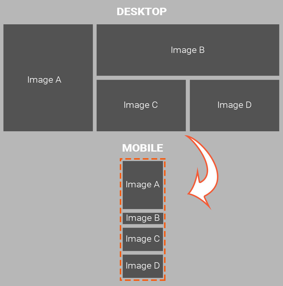
Hi Everyone, I'm currently building a new store using the Panda theme but I'm having trouble getting the Advanced Banner module to do something I just expected it would do out of the box. Basically, I created a group of four images (see illustration below) and what I wanted them to do on a small screen is collapse into a single column. Instead, images are simply resized which just isn't going to work (just too small). Am I using the wrong module for the task at hand or have I missed something? Also, has anyone managed somehow to get this to work with Panda, perhaps with a different module entirely?

-
Hi guys, I own and operate an established online store in Australia. I stumbled on TB by accident and one of the things that really attracted me to this platform was its stability, however, the checkout is a bit of a letdown. And considering it's where business gets done, I'm of the opinion that a one-page checkout must have, as a minimum, three important features: 1) Ease of use 2) Stability 3) Speed But a checkout that looks great too is probably the 4th feature that is usually lacking in most shopping carts and TB is no exception. I know this from 14 years experience as an online merchant/retailer in Australia. The cart that we currently use, which is on another platform that I won't name, has been a letdown for a number of years, and especially so in the last 18 months. It has a confusing layout, it's slow to load and use (keeps pausing/locking the page whenever there is a delay in a user's keystrokes), and it even has a few intermittent bugs that prevented some customers from submitting their order. And these are just some of the reasons that we are now migrating to TB. Anyway, the point I'm making is this. A good looking and bug-free checkout that is quick to process payments is really all you need. And TB is already 2/3's of the way there so in my opinion the only thing left to really do is for someone to give it a facelift. The logic looks fine. The speed of it is fine. And we all would agree that it's also fairly stable so lets see/discuss how it could be made to look better as well. Nickon, I think you've done a fantastic job with your Transformer checkout. It's actually the sort of checkout I would love to have for my store. Correct me if I wrong, but the fact that the cart (second column) follows you down the page is in my option a very underrated feature that should be offered on every OPC. From what I can tell, the stepped checkout already has this so I can't see why it couldn't be adapted.