-
Posts
821 -
Joined
-
Last visited
-
Days Won
5
Content Type
Profiles
Forums
Gallery
Downloads
Articles
Store
Blogs
Everything posted by dynambee
-
When you first install TB 1.1.0 and then go to Preferences -> Core Updater, if you select "Bleeding Edge" it defaults to version 1.0.x and not to the installed version of 1.1.x. (Once you have done an update once it defaults to the version it has updated at least once.) If you're a little tired and don't notice this (like I was a short time ago...) and go ahead with the update it will completely bork your store. It deletes the Niara theme but doesn't enable any other theme and of course this results in endless 500 errors when trying to access the front end. Even trying to enable the old community theme once this has happened doesn't seem to work. Recovering the store to 1.1.x might fix it but once a shop is that badly screwed up it's hard to trust that it's going to be okay again. Thankfully it was just a new shop for dev/testing so I just wiped it and started over. Anyway, the default should be the currently installed version, or if that is impossible then don't default to anything. Displaying an older version as the default in the updater doesn't seem like good UX to me. Even better, if a store is a new install of 1.1.0 don't provide the downgrade option to 1.0.x at all. If someone really needs 1.0.x they're likely much better off starting with 1.0.8 and upgrading from there. If it can't be removed, some sort of warning & confirmation about the disaster about to be unleashed would be good.
-
The issue is that most of the English speaking world is in the US and the US uses states. If you're in Canada (provinces), UK (counties), Japan (prefectures), etc then things have to be manually changed. The bigger issue IMO is if you ship globally and want to use different terms for different countries. It'd be great if the label updated automatically depending on the country chosen but generally it's just managed by having "language choices" the user can make. English (UK), English (US), English (Canada), etc and then having the appropriate translations as needed.
-
I've been doing some more tests & checks before reporting the checkout issue to Jonny (Panda theme creator). I'll use "cart dropdown" to mean the cart contents summary that can be viewed by hovering over the basket icon typically located in the top-right corner of the screen. I'll use "checkout page" to mean the cart contents displayed on the checkout page. This is what I have found: Thirty Bees Niara "cart dropdown": Does not seem to allow deleting items from the cart. Thirty Bees Niara "checkout page": Uses a small trashcan to delete cart items, class name is 'icon-trash' Panda theme v1.5 "cart dropdown": Uses a small x to delete cart items, class name is 'icon-cancel' Panda theme v1.5 "checkout page": Uses a small x to delete cart items, class name is 'icon-cancel icon-small' Chex module with Panda theme v1.5 "cart dropdown": Uses a small x to delete cart items, class name is 'icon-cancel' (seems to be the Panda theme "cart dropdown") Chex module with Panda theme v1.5 "checkout page": Uses a small x to delete cart items, class name is 'icon-remove' I guess the problem now is that I have reached the limit of my knowledge in this area. I have not been able to find if there is an official list of classes that should be supported by each theme, and honestly I don't even have a full understanding of how this is supposed to work. I'm getting quite a crash course in the basics of web development (which is good) but it's frustrating to not be able to debug these issues myself. However I did use grep on the chex directory and found that icon-remove exists in two javascript files. I edited those files and replaced icon-remove with icon-cancel and after doing this the checkout renders correctly on Panda and the X icon deletes the cart item as expected. I don't know if both icon-remove and icon-cancel should be supported by Panda (Panda bug) or if Chex should use icon-cancel and not icon-remove. If you can point me in the right direction with this I can report the bug to @Jonny if necessary.
-
Thank you for your reply and for considering my suggestions. 13 hours ago, datakick said: This is already there - see the video above. It uses 'icon icon-remove' class -- maybe your theme does not have these classes defined I will report this as a bug to @Jonny on the Panda support forums. Using Chrome's Inspect feature I can see that the x should be there, and when I revert to the Niara theme it does appear. I think that as you said it isn't implemented in Panda. Hopefully they will be willing to add support for it. 13 hours ago, datakick said: I can't reproduce this. This works ok for me. You can have a look at this video (it also shows the remove icon) I reverted to Niara and uninstalled all the Panda-related modules, as well as the custom shipping modules I use. I still have the same problem, and used a screen recorder to try and show what is happening. Excuse the poorly done recording, it's my first time doing this: It wouldn't surprise me to find it's still something I'm doing wrong, I just can't figure out what it might be. If you would be willing to take a look at my site I'd be more than happy to provide back office access and/or shell access as needed.
-
I would highly value the ability to create an optimized mobile experience for customers. Every year the percentage of traffic & sales from mobile phones increases but mobile site design still seems to take a back seat to desktop design in many cases. This is happening in the US now but in many places sales from mobile phones already exceed sales from desktops, and the gap is growing. I would also really appreciate being able to quickly & easily set standards for item types that are used across the site. Standard button design, standard button border color, etc. Then have the ability to override those standards for specific key items.
-
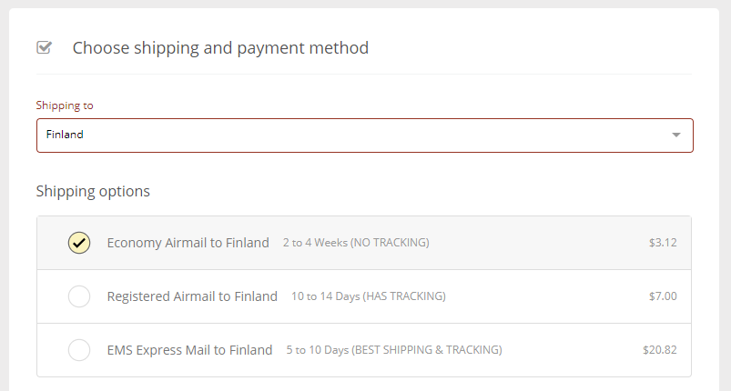
Oops, and I found one more potential bug: When the cart is edited and the quantity of items is increased to the point that the currently selected shipping carrier is no longer available (cart is too heavy), the selected shipping carrier is removed when "Done" is clicked. That's exactly what should happen, as described above as well. The problem is that when the currently selected shipping carrier is removed, no shipping carrier is selected at all. When this happens a message appears in the cart summary (Shipping line) that says, "No carrier available". However there is a carrier (or many carriers) available, it just wasn't automatically selected by the cart when the other carriers were removed. So I suggest that after a cart update is done if there is no carrier selected that the first carrier in the list of available carriers should be auto-selected by the cart to avoid the "No carrier available" message. Starts with this: Then when I increase the quantity (and therefore weight) to make Economy Airmail disappear, this happens:
-
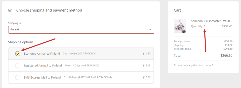
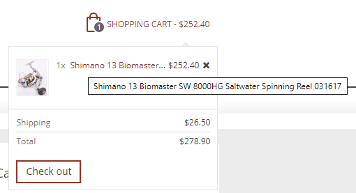
I may have found a couple of bugs. Testing Chex 0.6.1 on TB 1.1.0 "bleeding edge" with Panda 1.5.0. I have disabled uninstalled my custom shipping modules to make sure they are not the cause of these issues. This may be related to the Panda theme, but when I change item quantities on the Chex checkout screen the total cart quantity shown on the shopping basket in the top-right of the screen does not update. Likewise the total cart value displayed next to the shopping basket in the top right corner of the screen does not update. When I increase the quantities of items in the cart if the weight exceeds the maximum for a given shipping carrier that carrier is removed when I click on "Done". Perfect, this is what is supposed to happen. Unfortunately when I decrease the quantity of items to the point that those other carriers should now be usable they do not reappear. Actually the first time I decrease the quantity (and therefore the total weight) and click on "Done" the carrier options do not appear even if the total cart weight should allow them. However if I change the quantity a second time to a different quantity (either higher or lower) that should allow those carriers then they reappear. And two (hopefully somewhat minor) feature requests: When the cart contents are displayed on the top of the checkout usually the name of each item in the cart can be displayed in full as there is lots of space. However when the cart is shown on the left side or the right side there isn't enough space and item names are often cut off, making it difficult for customers to tell exactly which items are in the shopping cart. As an example, I sell an item called a "Shimano 13 Biomaster SW 8000HG Saltwater Spinning Reel" and a different item called a "Shimano 13 Biomaster SW 8000PG Saltwater Spinning Reel" but in the cart both are shown as "Shimano 13 Biomaster SW 800...". It would be fantastic if hovering over the item name caused a tooltip to appear displaying the full product name. The small cart list in Panda does this and it's great: Also as can be seen in the small Panda cart list above, there is a little x to remove the item from the cart. Right now with Chex a customer has to decrease the quantity to 0 and then click "Done" to remove the item from the cart. While I would sooner that customers never take items out of their carts, they are going to do this sometimes and having a little x mark or a mini trashcan icon to make this a bit more intuitive for customers would be a nice touch, IMO.
-
-
THANK YOU SO MUCH! That worked perfectly and now when selecting countries the correct carriers pop up, with only the ones allowed for the current cart value showing. This is awesome, I can't tell you how happy I am right now!
-
This is fantastic! I will keep testing the module as my site development progresses. So far it looks great! Earlier in the week I sent via PM my custom shipping carrier module that causes the country/shipping selection lag. Looking at the new version of Chex the same issue exists. Any idea about what I can do to work around this? Thank you so much for the new version!
-
There's a bug in v1.5.0 of the Panda theme that can result in badly formatted category pages on mobile devices. I reported the bug to ST Themes and they were very quick to fix it. I suggest anyone else here also implement the same fix, it is described in the ST Themes' Panda forum here.
-
- 5
-

-

-
I love Chex, it is very similar to what I would have developed myself if I had the ability to make a one page checkout myself (which I don't, although I am a programmer.) However I don't think this is really your fault. The module should give an error in the "shipping & billing address" section when there are saved addresses available but they don't match the country selected for shipping. Something like, "Selected shipping destination does not match any currently saved addresses." This sort of mismatch is certainly possible to happen and customers may not notice what is going on. Personally during my testing I didn't notice what was going on, and during your testing you didn't notice what was going on. It was only by chance that I figured it out, and only yesterday! During the address creation process there is no place to select State or Country, and no display of which State or Country has been chosen. If a customer has been trying different destinations out of curiosity to see what different shipping costs would be (and this is totally something I would do myself...) they could end up leaving it on the wrong country and then creating a shipping address to the wrong country. Chex works differently to most other checkout modules, and that is what makes it so awesome. On the flip side though it also means that it works differently to what customers are used to using, and because of that it needs to be extra clear about what is going on to avoid mistakes & confusion. That's my opinion, anyway.
-
I've been doing a LOT of testing with Chex recently as I really want to use it on my upcoming sites. Looking at your screenshot it looks like you have selected "East Sussex" as the destination country? Have you redefined countries to be something besides countries to make Chex work better for your situation? My testing experience has been that if the saved address' country does not match the country you have selected in Chex's drop-down list to get a shipping price then the saved address will not be presented as a shipping option. So my best guess would be that the saved address has United Kingdom (or some other country) set as the country but the drop-down list of countries has East Sussex selected. Is that correct?
-
Could you open the "Shipping and billing address" section and post another screenshot? You can blank out your address details, but since that's where the situation is happening it would be good to see that part of the screen.
-
Thanks for taking the time to reply and explain. Very much appreciated. I really like the module and I really want to use it on multiple sites. (Bought for one, will buy for more.) I think a State field needs to be shown if it isn't already in the "shipping and payment" section as a drop-down list. There are countries where states exist but TB doesn't have data for them, and that's fine, as long as the user can type in their shipping address completely. If something (country and/or state) has been shown & set in the "shipping and payment" section then the selected choices could be shown as a non-editable field in the address creation area. A small note below that could say that these are set in the "shipping & payment" section and that the customer must change them in "shipping & payment" if they want to ship to a different country and/or state. This would avoid customer confusion without also having to write code to update the country and/or state from multiple areas. I keep testing the module and coming up with more ideas to suggest but I think a good number of my ideas may have been suggested before. Is there a list of ideas in the queue that can be reviewed so we don't keep suggesting the same things to you? With 8 pages in this thread now it's hard to keep up with everything already here. That said, I have a few more suggestions (which someone has probably already suggested, but I'll throw them out there anyway...) If no user is logged in there should be a "login now" option directly on the checkout screen, same as in the standard TB checkout. When users are logged in the default in the address section(s) should be the list of saved addresses with an option to create a new one. For quite a while I actually thought that Chex didn't offer the ability to select a saved address because the link to swap from "create new address" to "select existing address" is quite faint and my eyes skipped right over it. I suspect most repeat customers will use a saved address so offering that to them as the first choice seems like it would save people a step & some potential for confusion. The "create new address" option could be within the same sort of address card currently displayed for saved shipping addresses. If a user is logged in and the country they chose for shipping calculation doesn't match the country of any saved address, there should be an error displayed about this in the address section(s). Right now there is just no option to choose a saved address, only an option to create a new address. Combine this with no state & country being shown in the address section and a customer could end up creating an address with the wrong state and/or country selected.
-
If you create some temporary credentials and send them to me through the PM system I can test on my server to see if I can connect and send a test message. At least then you will know if it is a server issue or a more general TB issue.
-
I've been looking at the state selection issue and guest checkout process in a bit more detail, and I think there is a problem here. The way Chex is set up currently, only countries that have states defined in the TB system (in the tb_state table, to be specific) have the option to select a state, and the state is supposed to be chosen to get a shipping estimate. There are two issues with this, IMO: As I wrote about previously, there are going to be quite a few situations where the state is not necessary to get a shipping estimate. This is true for most people who ship internationally, and it would be true even for domestic shippers who offer flat rating shipping. It would be nice to allow the shop owner to decide if the State field appears together with the Country field at the start of the checkout process. On the flip side, if the customer is going through Guest Checkout and manually entering their address, there is no State field in the address area. There are many countries that have states, provinces, or similar that do not have listings in the TB database. Malaysia is one. South Korea is another (though it is not always used that way). In Switzerland a canton is sometimes used in addresses, but not always. Basically the State field should always be shown in the Guest address creation area. For countries that have states defined it should be a drop-down list, and for countries that do not have states defined it should be an optional text entry field. This is the same way TB treats address creation for Guest Checkout, and the same way users with accounts create addresses. I'd also add that for some users it will be confusing to not have a Country option when they are creating a Guest Checkout address. As shop owners and developers we understand what is going on intuitively but to a shopper who is perhaps not all that technically oriented they are going to expect to see a Country field when creating their shipping address. Ideally the Country field (and the State field in case of a drop-down) should default to whatever they chose earlier in the checkout process but from a UI / UX perspective they should both be shown, in my opinion.
-
Whoa. What is stopping you from using the SMTP setup? I have been able to use it with Google Apps (now called G Suite), my previous self-hosted email system, postmark, and (I think?) Open SRS mail as well. It does seem to work okay in a good number of situations, it's just that SMTP is a slow protocol not designed for quick transfer.
-
I'm using postmark to send order notifications, tracking info, etc. They have an API which at one point I was able to get working but eventually I gave up as I was having random problems. They also offer SMTP servers which aren't quite as fast as using their API but it's "good enough" for my needs right now. (I signed up for postmark before they changed their pricing so I have no monthly minimum costs. Their monthly minimums are super reasonable, IMO, but not having one at all is still better.) It would be great if support for these sorts of mail sending APIs was integrated directly into TB as an option to use instead of SMTP.
-
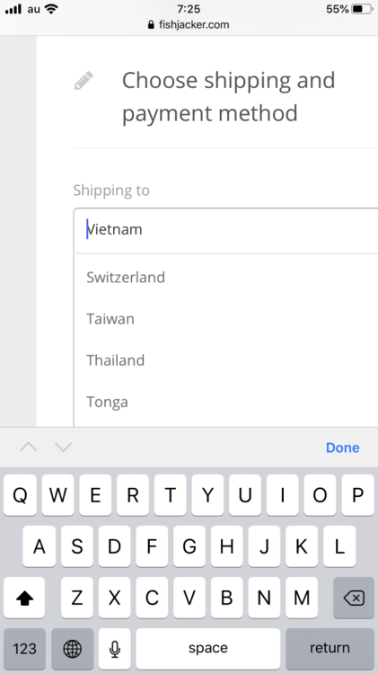
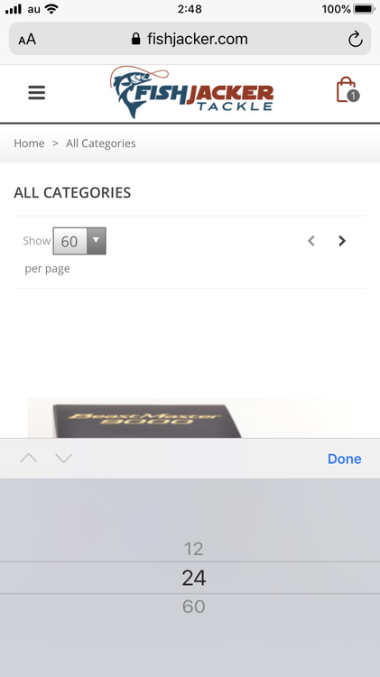
I stumbled across an example that better illustrates what I was suggesting for mobile list selection, at least on iOS (I don't have a modern Android phone to test with, unfortunately). When clicking on the country list in Chex it presents a desktop-style drop-down list, like this: However the default (again on iOS) for list selection is this, as shown from the "products per page" selector: I don't know how difficult a change this is but it would definitely make the checkout experience on mobile to be a more mobile-like experience.
-
Sorry, forgot to include this. Actually I just disabled both the custom shipping modules I have and even after disabling them the same country selection / shipping carrier issue persists. I'm just running out the door right now but when I get back later I will do a full site backup and then change back to the Niara theme and see if the problem persists. It might be a compatibility issue with the Panda theme, or it might be something to do with the way I have carriers set up. Once I know more I'll add another reply here.
-

"NEW" Badge on new items -- Where is the date stored?
dynambee replied to dynambee's question in Technical help
I should check out Prestools one of these days, I'm sure I would learn a good chunk about how PS and TB internals work. What I was trying to do though was update the value in the db directly to match our actual product creation date for a given item. I do this with direct db writes through an SSH tunnel just after the API call creates a new product. Now that I'm doing the update to both the `product` and `product_shop` table it is working fine. -
So the chex module can't opt to use the smartphone OS's own scrolling system for selecting from drop-down lists? That is something that needs to be added by TB itself? @lesley, any thoughts on adding this ability to TB or is it something that has to be done on the theme level? Thanks, I'll look into seeing why Panda doesn't provide this image type, or if I can extend Panda to provide this image type. If not then I'll modify chex to use a different image type. Thank you! 🙂 The States list & selection is presented now for countries that have states set up and enabled. The US, Canada, Australia, and a few others. For other countries, even if they have states/provinces/etc no State option is there. Maybe it's not possible to ignore states for countries that have them enabled, but if it is it would be helpful for a lot of people. Thanks, I'll look into this.
-
Really liking the module, as I test I have come across a few things that I think would make it even better: Please allow the website owner to decide (backoffice setting) if inactive countries are shown in the drop-down list of countries. I suppose I could just delete the countries that we don't currently use but I would really sooner leave them inactive and not have them show up during checkout. (Just because we don't ship somewhere today doesn't necessarily mean we won't ship there in the future.) Please allow the user to decide if State selection is offered in the Shipping & Payment section. For people who ship to domestic addresses the state is often necessary to decide shipping costs but when shipping from overseas there is often no difference in shipping cost to different states. Allowing the website owner to enable or disable this in the back office would be great. Would it be possible to allow the user to customize the message shown when no carrier is available? For many countries we have weight and price limits for shipping so just telling users that "We don't offer shipping to this location" isn't accurate. We do offer shipping, just not for the value and/or weight of the items in the cart. If we could include a link to a CMS page or blog post explaining this in more detail that would be even better. Those are my ideas for now, I'd really love to see them integrated into the module!
-
I'm setting up a site with the @Jonny's Panda theme and your (@datakick) fantastic Chex one page checkout module. Overall things are working well but I have noticed a few issues. They may be specifically related to my site or they may be more general. 1. On a small screen iOS 13.1 device (iPhone 7 Plus in this case) when clicking on the `Shipping to` dropdown to choose the country, the browser zooms in to the list to make it easier to read. This isn't necessarily a big issue but after selecting a country the browser does not zoom back out, leaving an off-center view where the checkout isn't properly visible. The user can manually zoom back out, but it's not a great UX situation. Ideally on an iOS device it would be great if the country list is presented in the standard iOS way, scrolling list that appears at the bottom of the screen. Many websites do this but I have absolutely no idea how easy or difficult this is to do. I'm also not sure how Android usually handles these types of lists. Example: 2. I have a module that use an override for `getDeliveryOptionList`. This module limits shipping carrier availability based on the value of the items in the cart, and I think this is somehow causing a conflict with Chex. The problem is that when I choose a new country from the drop-down list the carriers for the previously selected country are shown. This means that for the first change of country the carriers don't change at all, and then for each subsequent change of country the previously shown country's carriers are displayed. Everything about the displayed carriers is correct, they just aren't for the right country. 3. The thumbnail for each product in the cart is not being displayed. Instead the standard TB camera icon is shown. I suspect this is because Panda doesn't generate the same thumbnails as Niara so the expected thumbnail is not there. Perhaps allow the user to select which thumbnail type will be used for these images? Any help would be greatly appreciated. I've been up all night working on the site so it's time to get a little sleep but I'll be back online as soon as I awake and can answer questions as needed.


