


colorful-ant
-
Posts
577 -
Joined
-
Last visited
-
Days Won
10
Content Type
Profiles
Forums
Gallery
Downloads
Articles
Store
Blogs
Posts posted by colorful-ant
-
-
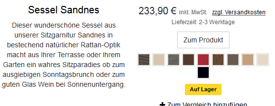
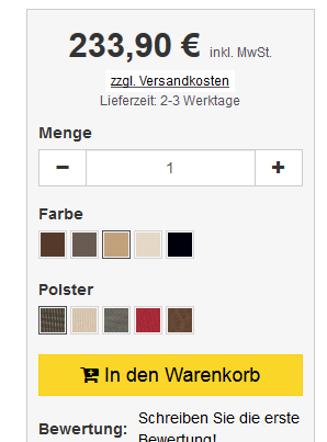
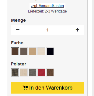
I have products with different color options. For example chairs or garden loungers: - Color of the frame / legs / etc - Color from the upholstery
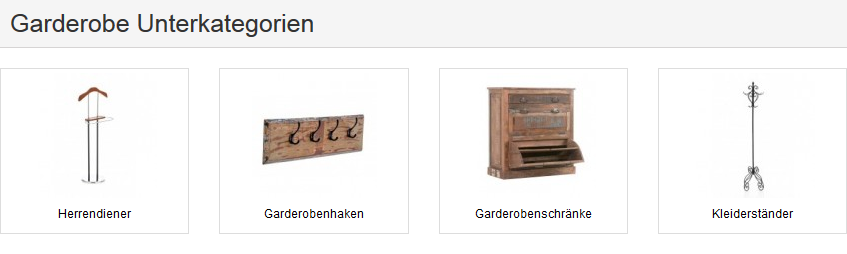
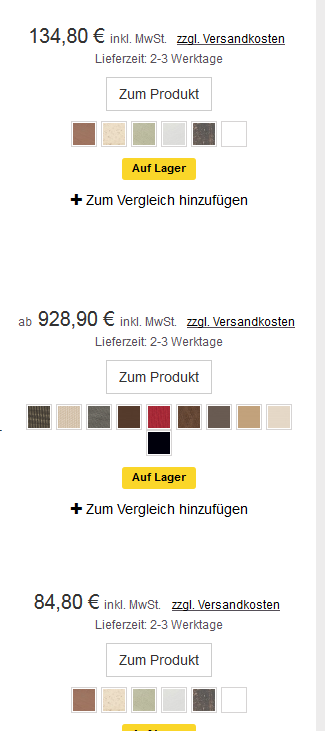
On the product page, I see these options separately. In the category view, all colors of both options are displayed in a color list. Thus, in the category view, I have the color list with all the colors, which can be very confusing.
example category on list

example product page
-
my problem default theme and long subcategory name
example change to
It is currently not the best solution, but for me it is currently ok. for example change httpdocs / themes / community-theme-default / css / category.css
```
category-banner {
margin-bottom: 15px; }
category-description {
margin-bottom: 25px; }
.subcategory-title { margin: 0; } ```
to
```
category-banner {
margin-bottom: 15px; }
category-description {
margin-bottom: 25px; }
.subcategory-title { margin: 0; font-size:85%; } ```
EDIT: The option to use the text with truncate, I find personally in this view not good. In my view, this option would look unprofessional. The customers / visitors should be able to read the subcategroy heading. Of course, the headline should not be too long, but it is not always possible to avoid adhering to the limited characters for the text field.
-
OK, too bad. The problem was not there for me anymore.
-
I understand a lot. However, various modules also have h2 tags. I wanted to suggest this as a possible improvement. Personally, that's too many for me personally. No matter if it is on the start page, the category page or the product page.
In the standard system / template I know it's ok ... But it's the total number of h-tags that I have on each page. Through the modules with their headings, the relationship between content and headings is negatively affected.
The content of a good page should have many words, but if there are more headings, much more text must be written and that should make sense to page fit. That is not always easy.
Therefore, I hoped that the modules could be improved with their headings for any updates. For example, instead of h2 to set a h4 or h5 or general headings css-class adapted.
-
Did you try to create a separate key?
-
new push
does nobody have an idea?
-
did you activate the module aeuc?
-
No -> PS is mostly compatible with TB. Look at the module of genzo-krona by @wakabayashi. This does also not work with PS.
-
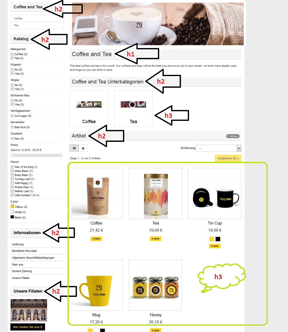
example category page new installation tb 1.0.4 without changes default theme and standard module
heading part 1
heading part 2
-
I correct - after many try with cache empty, it finally worked. although the cache was disabled.
-
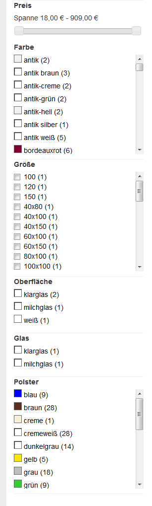
I do not know if it's a bug. In the filter module the colors with patterns / pictures are not displayed in the FO, only if I have entered a hex code.
product page and category page is ok with patterns
product page
category page
blocklayered
-
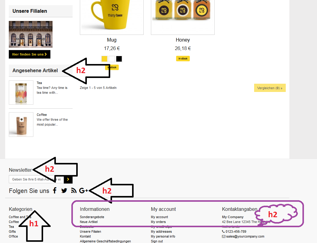
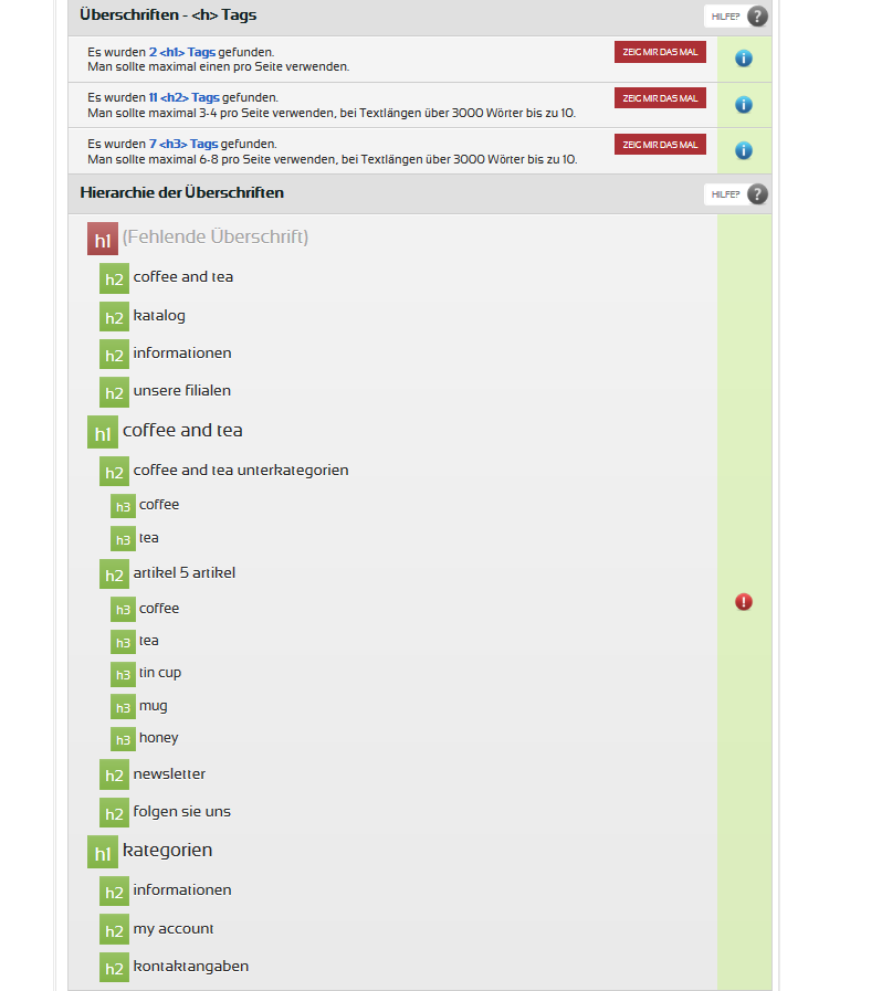
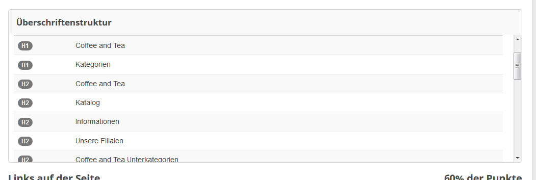
I do not know what that plays a role with which page the rating was created. I think it does not matter if it's the start page, a category page, product page or CMS page. In all cases the headers with the tag h2 are stored in the footer blocks. If necessary, the sidebar. I am not an SEO expert.
- Overall, there are too many headings from h1-h3.
- Product page with little text.
to 1. However, I think that there are too many headlines in total. These many headlines are probably still a remnant of PS. to 2. As an example: a product page with little text, because there is not much to write for the article. For pages with little text and many headings, the content is rated poorly because the recommended ratio between headlines and text is rather negative.
-
if I understand the question correctly - Category page
-
if it does not work, create a separate key. It can sometimes take several hours for it to work.
-
please wait few minuts and try it again .....
-
This was a normal and new installation of TB 1.0.4 with the standard modules. At the time, no changes were made. Online tested with - seorch.de -or https://seorch.eu/ - seobility.net - or https://www.seobility.net/en/seocheck/
-
For the next updates of the standard template and some modules, I recommend an improvement of the headings. In a test installation and a live shop some headings of h1 - h2 are too much and duplicates are present. Tested on seorch.de and seobility.net.
Pictures of the evaluations of the test shop
-
-
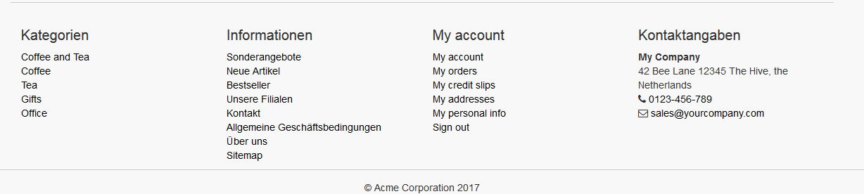
i think the headings of the moduls (bottom)
- categories (blockcategories)
- informations (blockcms)
- my account (blockmyaccountfooter)
- contact (blockcontactinfos) do not need headers in size h2. optionally use as h4 or as p tag with a standard css to get a larger font.
-
-
@yaniv14 thank you, now looks better :D
-
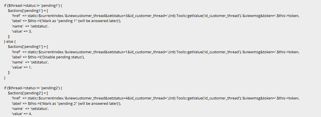
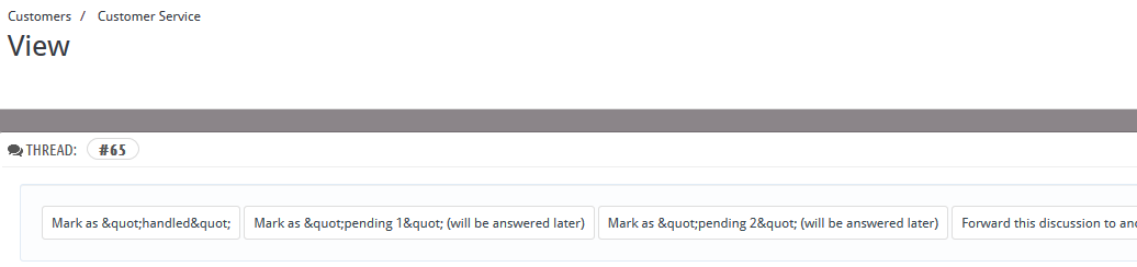
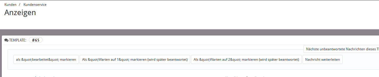
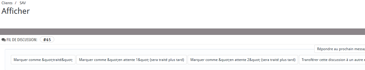
httpdocs / controllers / admin / AdminCustomerThreadsController.php
I found the code now, but I do not know why it is in the BO with & quot; is shown and not "
-
since update to 1.0.4 - BO -> AdminCustomerThreads
. english
. german
- french
i cant find the code for this to fix it
-
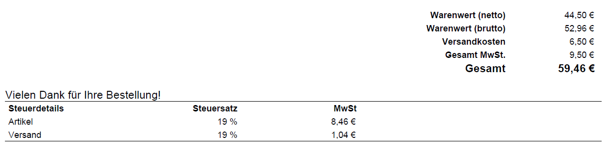
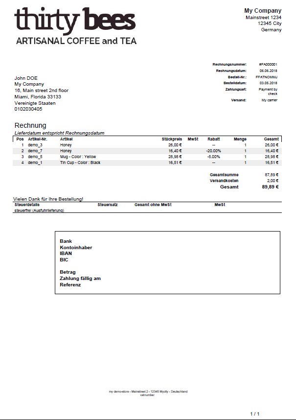
in the example above with payment by bank transfer and direct generation of the invoice
this example is with payment by Paypal and tax details without change the "invoice-eleazar1612.tpl"
-
@pedalman I have now got an answer and provided the files under tips https://forum.thirtybees.com/topic/1817/pdf-invoice-eleazar
-
I have now received help from an ex-forum member. The customized files from eleazar PDF-invoice for TB and help from mddekker.
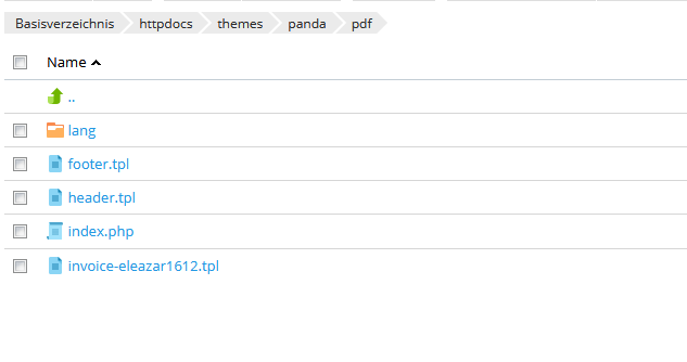
Note: unpack the zip-file 1. copy the override file in the same folder 2. upload the pdf folder files in your template pdf folder 3. change the header.tpl with your dates/company
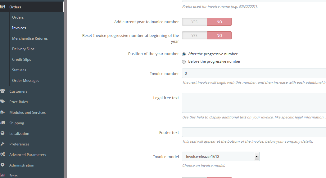
- change the pdf template in your bo -> orders - -> invoices ---> invoice option ----> invoice model
and save
- change the pdf template in your bo -> orders - -> invoices ---> invoice option ----> invoice model
and save
-
gehört zwar nicht direkt zum thema - eben wieder ne kleine info/hilfe aus den onlinehändlernews
Wir wurden gefragt: Wie weit geht die Auskunftspflicht der DSGVO? https://www.onlinehaendler-news.de/recht/rechtsfragen/31785-wir-wurden-gefragt-wie-weit-geht-auskunftspflicht-dsgvo.html?utmsource=Newsletter&utmmedium=Link&utm_campaign=Weekly

category image small devices
in Theme help
Posted
A few days ago, I noticed that for small screens (like cell phones and tablets), the category image or background will enlarge the screen when I'm in the category. The smaller the screen, the less I can see the category image. and must scroll to the right.
- - and image small 2
i m looking for css class but can not find all on global.css img-responsive tb-lazy-image tb-lazy-image--handled tb-lazy-image--handled