-
Posts
752 -
Joined
-
Last visited
-
Days Won
42
Content Type
Profiles
Forums
Gallery
Downloads
Articles
Store
Blogs
Everything posted by toplakd
-
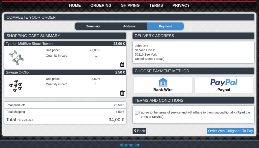
At last checkout page changing address should be disabled, as carrier is already set on the previous page. Same is with changing quantity on last checkout page. Should be disabled for same reason, as if enabled one can get free shipping once getting over the carriers range, as shipping goes to 0 if overweight and one can still place the order. So on my last checkout page one can not change the address, or change the quantity, but it can delete the products from the cart. The main problem is, that the advanced templates are not up to the date as they are not well maintained and tested.
-
to @AndyC and all others that want to change the looks of their shop, but don't have the knowlege there are 3 options: 1. Buy the template that suits your needs. 2. Hire someone to do the styling (of default or bought theme if it needs adjustments. 3. Take some time, patience and coffe and learn how to do it by yourself. Option 1 is the cheapest regarding $$ as premade templates are sold to many people not just one. Option 2 is mosty costs x-times more $$ than the premade template as it's mostly for single shop. Option 3 is where it's hard to put the value on. As it takes a lot of time patience and coffe, but in the end you are satisfied as you did something on your own. So if you decided to go with option 3: 1. Learn how the inspection tools work in modern browsers and disable Smart Cache for CSS in shop settings. 2. Learn about how the templates are working 3. Learn some basics of css styling If its not working after that, repeat the steps from 1-3. Happy styling. 🙂
-
I strongly suggest to do some reading about css/template editing before you start. Good start is here: https://www.w3schools.com/css/ 2. For finding where the things are (in which css file/line) you can use Inspection tools (most browsers have them). 3. Yes, edit the cms template. 4. In maintenance template 5. You can use translations in back office for that, where you replace every "manufacturers" word with your desired word. Editing complete template is not as easy as it seems if there is not enough knowledge in the background. So suggestion is to learn a lot and spend a lot of time, or buy some commercialy available theme. It all depends on what are you looking for.
-
ThB cite is shaking while top menu switching in Google Chrome
toplakd replied to Suppir's question in Technical help
body { width: 100vw; margin: 0; overflow-x: hidden; } To remove flickering: Advanced Parameters / Performance: CCC (Combine, Compress and Cache) - Move JavaScript to the end - Set to yes -

ThB cite is shaking while top menu switching in Google Chrome
toplakd replied to Suppir's question in Technical help
You can add following to the body in global.css width: 100vw; -
Have you at least tried to create a test post and tried to add the image? It's purpose is to add the main image to the post, if you have selected it and clicked on the "Add file" button.
-
Virgin TB 1.0.8 with core updater to 1.0-X: Can add as many products as I wish, and the button is always there. Same with discount button. Virgin TB 1.0.8 installed just now. Buttons are always there, no matter how many products are added or how many different discounts I add, buttons remain available. @Chandra If you wish to test it yourself, than contact me through PM and I'll give you access to my tb install.
-
Mostly problem is not in thirty bees, but on another side of computer screen.
-
He has this enabled. And all problems start there. It was a hint. One should first try and learn the system before starting to modify it and writing this does not work, that dont work etc.
-
As all your questions are related to same problem, you could continue there. I already posted a hint to solution in your other thread. And once more here: Never recompile templates
-
You can change/reposition almost anything if you are willing to learn how things are working. But without that strong will, it will be hard. Templates are easy to read, and once you know it, you will read a code like childs story book. Short video of my thirty bees, with modded default community theme. (iphone 375*667 size) I'm not a coder or programmer, but I did spent a lot of hours figuring how things work, reading a lot about css styling, etc... https://youtu.be/Ik-4PXLhFwk
-
themes/community-theme-default/modules/blocknewsletter/blocknewsletter.tpl Removing col-xs-12 col-sm-3 shows the newsletter in left column in 100% column width. And your other issue with facebookblock is related to same problem - not understanding how the system and templates are working. And if editing above file is not working for you, than you have one option enabled which you should disable if you are editing theme files. Never recompile template files
-
Its not screwed up instalation. You cant move something that has its width value set as 25% of current space (center) to another space (column) and expect that it will automaticly be 100%. So those are not weird issues, as block are displayed in the width which is selected for them. 25%. You need to have some coding knowledge if you want to reposition the stuff into places where it's not intended. And opening new topic for everything (related to same problem) won't help that issue either. Not knowing how to move/code/style the things does not mean that they don't work out of the box in thirtybees instalation. So best start is to learn how templates work in thirtybees/prestashop and some (much) learning on css styling and some (much) learning on template coding. If that's too hard, than i would suggest to look into some commercial templates and buying the one that suits your needs.
-
Parrent / child relation #footer a { or just for blockcms-footer #blockcms-footer a { and so on. I suggest some reading on: https://www.w3schools.com/css/
-
You have to edit it's .tpl as it most likely has col-sm-3 property. And this percentage now calculates from Left column width. Try with browser inspection tool and remove col-sm-3 and it will most likely expand to complete width of your left column.
-
Andy, price is not added to text area. This module only adds posibility to deactivate customization fields on combinations. Price is added in the combination as normal when you create them, and you activate customization only on combination that includes your engraving. So you create your combinations as normaly with thirty bees, first combination is normal product and you deactivate (this module) the text field for normal product. Than you create second combination - Product with engraving, and activate (this module) the text field for this combination and you can choose increase price as ussual with combinations.
-
That module activates/deactivates customization field for combination you choose and you can set prices on combinations. So you create combinations: 1. Product (deactivate customization and in set impact on price to none) 2. Product + engrave (activate customization field and set impact on price to increase).
-
You can also look at this module. It enables/disables customization fields based on what combination is chosen. So for example, if you have product and product+engraving, the second combination can show text input field. And it's little cheaper. You have to think that way - if you are making additional money with engraving, than good module will bring you that money back and will cover it's cost sooner or later. https://addons.prestashop.com/en/combinaisons-customization/20548-customizations-by-combination.html
-
As it seems, unchecking removes the subscribed email, but email is not removed from modules tables. This could be a bug 🙂
-

Cannot select Payment and shipment options to finish order
toplakd replied to piet's question in Bug Reports
It could be something with the theme. You can try the TB default theme with One Page Checkout to see if its working there. -
Submenus (top or left orientation) are working just fine on Fresh 1.0.8 and migrated 1.0.8, so the problem must be somewhere else for this not working on your install. Screenshot taken from total fresh install via Softaculous.
-
Try to install it and play with it a little. That will answer most of your questions. Easy: yes Coded good: yes Working: yes Issues: most issues come from other side of the computer screen.


